EAZE is a vape designed to help people manage their emotions when they are at their peak. Many people today are overwhelmed by their own emotions, and I am no exception. Over the past year, I struggled with the turmoil of my own emotions, so I started this project to control my emotions and expanded it to create a product that could help many others. The idea that emerged from this is Eaze, a vape that helps control overwhelming emotions when they become too intense.


The design clearly shows what product is being advertised, making it easy for people to understand. The packaging features the Eaze branding and includes visual cues about its purpose and benefits. By incorporating playful elements, the posters and billboards ensure that consumers can quickly identify the product and grasp its positive impact on emotional well-being.


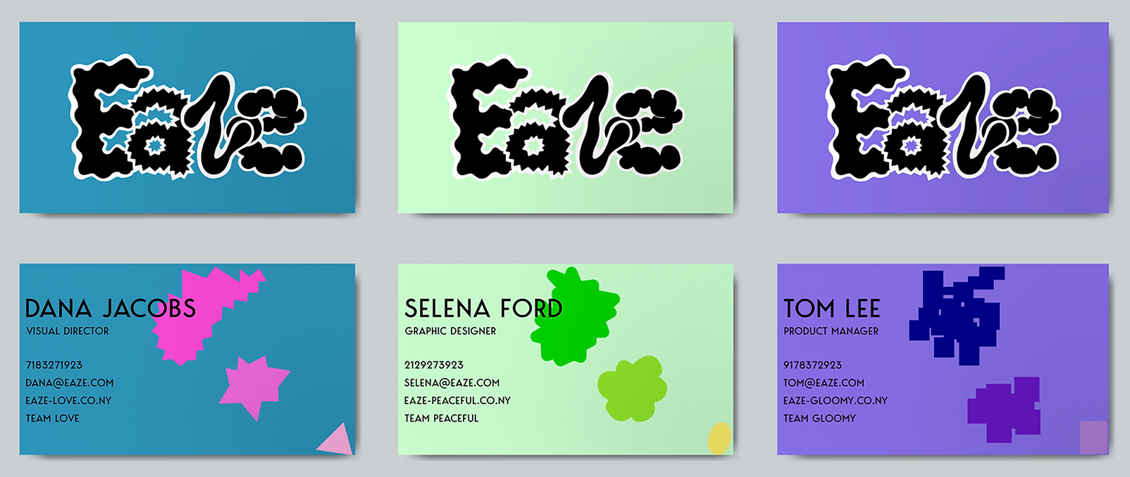
These are the store's signboard, staff T-shirts featuring Eaze's iconic logo, and business cards, all showcasing our brand's identity and professionalism.


Recognizing one's emotions and seeking help to alleviate them should not be seen as shameful but rather as a natural and playful activity. Therefore, the overall package design has a playful feeling. When people open the package, they will find a set of trading cards featuring the character representing the emotion that the vape helps to alleviate. By looking at the card, people can see the evolution of the emotion and visually track how their own emotions have progressed.


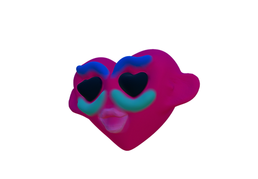
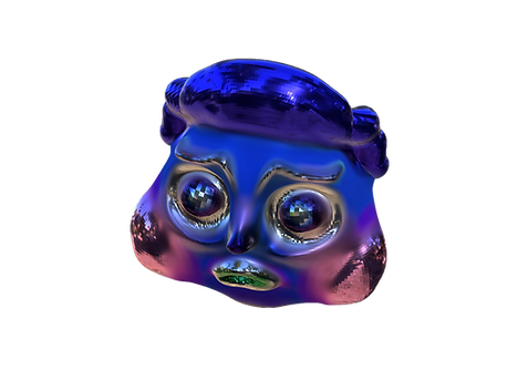
Facial expressions are the most effective way to convey emotions. To visually communicate the concept of invisible emotions, I created creatures based on facial expressions. I believed that emotions could not be categorized by a single expression, so I illustrated the changes in the emotions I felt. I realized that almost all emotions eventually ended in anger, indicating that I had a lot of pent-up anger over the past year. However, through this process, I was able to gain a deeper understanding of my emotions and felt that many people could relate to this experience.


People do not feel just one emotion but experience a variety of emotions. I tried to capture the characteristics of human emotions in the different types. All the types were created based on hand-drawn illustrations. Like human emotions, which can be sharp at times and rounded at others, these cards include a variety of shapes.

Before designing the actual vape, I created a pattern based on the types I developed. The numbers written below, from 0mg to 6mg, indicate the nicotine content in the vape. The tumultuous and chaotic emotions are visualized as jagged and irregular shapes, which become more simplified as the nicotine content increases, symbolizing the process of calming down as one inhales Eaze.
The colors are chosen to demonstrate that using Eaze can have a positive impact on people. I wanted to show that vaping isn't just about negative effects but can also be a product that provides positive benefits.


To understand which emotions I experience the most, I kept an emotion-based diary for a year. After a year, I reviewed the diary and extracted my emotions by listing them from the most frequently felt to the least frequently felt.

This digital magazine serves as a platform to showcase the evolutionary journey of the project to users. Through engaging visuals, informative articles, and interactive content, users can explore the various stages of development, from initial concept to final product. The magazine provides insights into the creative process, challenges faced, and innovations made along the way. It aims to captivate users' interest and provide a comprehensive overview of how the project evolved over time.